
Well, for better or for worse, Georgia Democrats now have a new web site (which rumor has it was not cheap). I think given the resources that have undoubtedly been expended, it’s fair to take a close look at what we got in return:
Logo: C+

You know, I don’t really dislike the whole deformed peach as much as everyone else seems to; it’s merely mediocre rather than horrible. I do take issue, however, with a rather oddly-selected landscape background and some stylized sunlight poking through the rain clouds, blah blah blah. Someone really over thought this thing – some blue sky and sunshine maybe, and oh, maybe enough color depth to lose the pixels, huh?
Events calendar: D
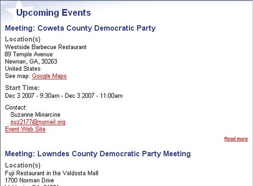
Is it me or is a really really really really long list of events a little user-unfriendly, setting aside whatever red-tape process is going to be in place for Joe County Chair to say “We have a barbecue on such-and-such a date, can you add it to the calendar”? There are 159 counties in this state. I hope this is one of those instances where Shelby is right about all the power of Drupal, because this isn’t going to cut it. If anyone at the DPG is listening, *please* give some real thought to how to make this event listing not suck.
Navigation: A-
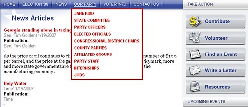
Lest I be dismissed as a playa hata, I will say that the navigation around the site looks clean and easy to use. I’m sure more options are in the works for these dropdown menus, and as long as pages and content are categorized reasonably I don’t think visitors will have a problem finding what they want, which brings me to…
Content: B+ If this were a finished product, I would be a lot harsher, but as a starting point the site puts a lot of basic information within easy reach. Those elusive bylaws that Steve Leeds and his crew hammered out are available, and the rarefied world of the DPG seems just a little closer now. On the other hand, there’s this little issue of…
Interactiveness: F This is a provisional ‘F’, because I have no idea what this Drupal backend can do or what future plans might be, but as it stands there’s nothing to do on the site other than submit a few forms, and there’s certainly 0 “cool” factor. I know I’m biased here, but let’s compare to a bare-bones Campaign Window site, which incidentally starts at the low price of zero dollars. With just a few clicks of the mouse, you can set up a CW site to allow people to create user accounts, join different groups according to their interests, update all sorts of personal contact information, vote in a poll, and comment on blog entries. Currently, if you want to volunteer, you can’t even click something that says “Sign me up”, you have to send an e-mail to Kelli Parsons or waste who knows how much time calling Spring Street.
Appeal to the public: C. This is an area where the content is thin. Someone who wants to find out about absentee voting can do so, but right now there isn’t much for Joe Random Voter who wants to know about these folks who call themselves Democrats. Compare with the Georgia Republican web site, which immediately looks to suck people in to their BS web of lies and deceit:

In the end, is the site for us (the activists) or them (the potential voters)? Where can Joe Random find out what the DPG’s message is? (Ok, that’s not really fair, since the download on our message is stalled at 72.5%) Quite frankly, where can Joe Random Potential Activist get some good old Democratic propaganda to bring them to our side? I hope that this content is forthcoming, because I don’t see as much as I’d like right now.
Overall: Needs Improvement I think overall that this is a good start (although maybe not worth as much as I think we paid for it). Ultimately it will come down to how diligent our staffers are in getting trained in how all this stuff works and making the site a real organizing tool that we WANT to use, not something that it has been decreed that we use. I’m mildly optimistic that things are still in progess on the site; I’m going to be pretty unhappy, though, if the site looks like this at this time next year.
Leave a Reply